boxplot(progress ~ sex, data = diabetes)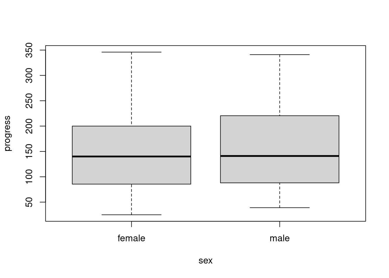
We can convert most univariate visualizations that we create with Base R graphics into conditional plots by specifying a grouping factor. We then get a single figure with group-specific versions of the univariate visualization.
We can use conditional boxplots to compare the distribution of a variable across groups. To create this type of figure, we employ the so-called formula interface when calling the boxplot() function. In the following code, we use the diabetes dataset to create sex-specific boxplots of disease progression.
boxplot(progress ~ sex, data = diabetes)
When we use the formula interface, we define the plot’s structure through an R formula object that we specify as the first argument to boxplot(). In this formula, progress ~ sex1, we specify the plotted variable on the left-hand side of the formula and we put the grouping factor on the right-hand side of the formula. We also have to use the data argument to specify a data frame where boxplot() can find the variables we’re referencing in the formula.
Use the titanic dataset to create a conditional boxplot to visualize the distributions of age within the groups defined by the survived variable.
survived = 'yes') vs. non-survivors (survived = 'no')?NOTE: The titanic dataset is already loaded into the working directory of this webr session.
boxplot(age ~ survived, data = titanic)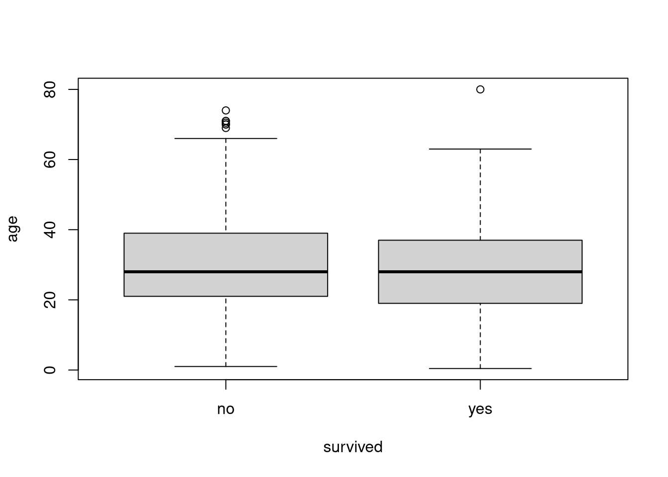
The median age does not seem to differ much between the two groups, but the survivors’ distribution appears to be more symmetric, and there are fewer old survivors. The non-survivors’ distribution is positively skewed by the disproportionately higher number of fatalities among older passengers.
Conditional bar plots visualize two dimensional contingency tables. So, these types of figure allow us to evaluate how the distribution of one categorical variable differs across levels of some other variable.
To create a conditional bar plot, we fist create a two-way contingency table, and then we plot that table with the barplot() function In the following code we use the titanic dataset to visualize the conditional distributions of ticket classes for the two survival groups.
# Cross-tabulate ticket class and survival status
tab <- table(titanic$class, titanic$survived)

# Visualize the table created above
barplot(tab)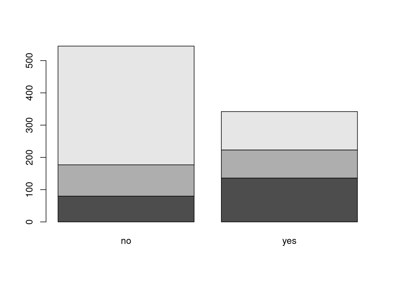
The default bar plot created above suffers from two important problems.
We can solve these problems by plotting the bars beside each other by setting beside = TRUE and drawing a legend by setting legend = TRUE.
# Create a better visualization of the table
barplot(tab, beside = TRUE, legend = TRUE)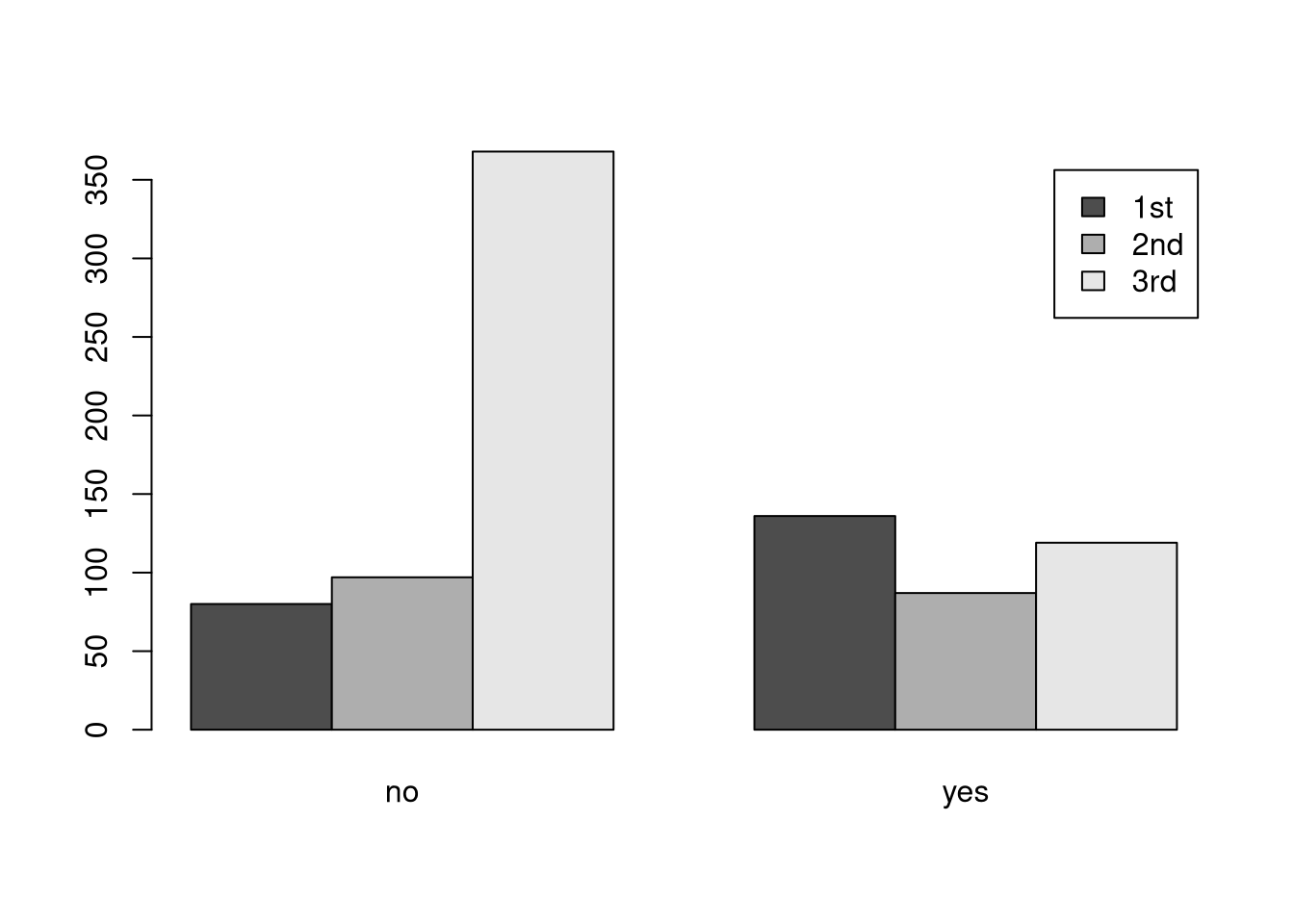
Now, we have a useful visualization. From this figure, we can clearly see that the relative survival rates of passengers traveling in third class were much worse than the survival rates of other passengers.
Use the titanic dataset to create a conditional bar plot to visualize the distributions of survival status within the gender groups defined by the sex variable.
What does this figure tell you about relative rates of survival between male and female passengers on the Titanic?
tab <- table(titanic$sex, titanic$survived)
barplot(tab,
        beside = TRUE,
        legend = TRUE,
        xlab = "Survived",
        main = "Survival Status of Titanic Passengers by Gender")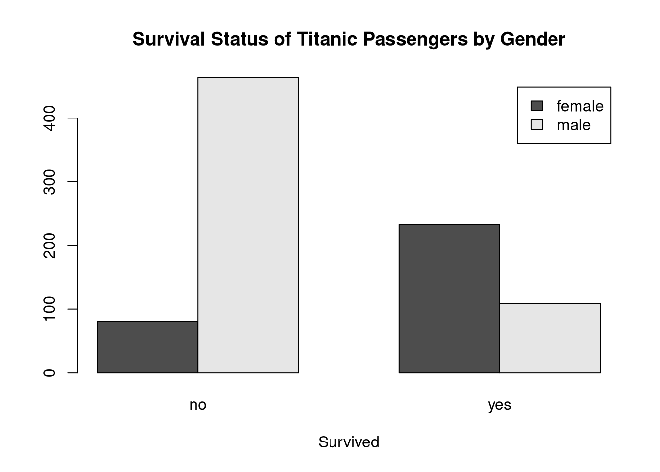
The relative survival rates are much better for female passengers. The number of males in the survived = 'no' group is much higher than the number of females, and the patterns is reversed in the survived = 'yes' group.
When generating histograms, we can’t really create the same kind of conditional plots that we can with boxplots and bar plots, but we can overlay different plot layers to add useful information to our figure.
For example, in the following code, we draw a kernel density plot on top of an existing histogram.
# Create a basic histogram of blood glucose levels
hist(diabetes$glu, probability = TRUE)

# Calculate the kernel density estimate of blood glucose levels
d <- density(diabetes$glu)

# Overlay the kernel density curve on the histogram
lines(y = d$y, x = d$x, col = "red")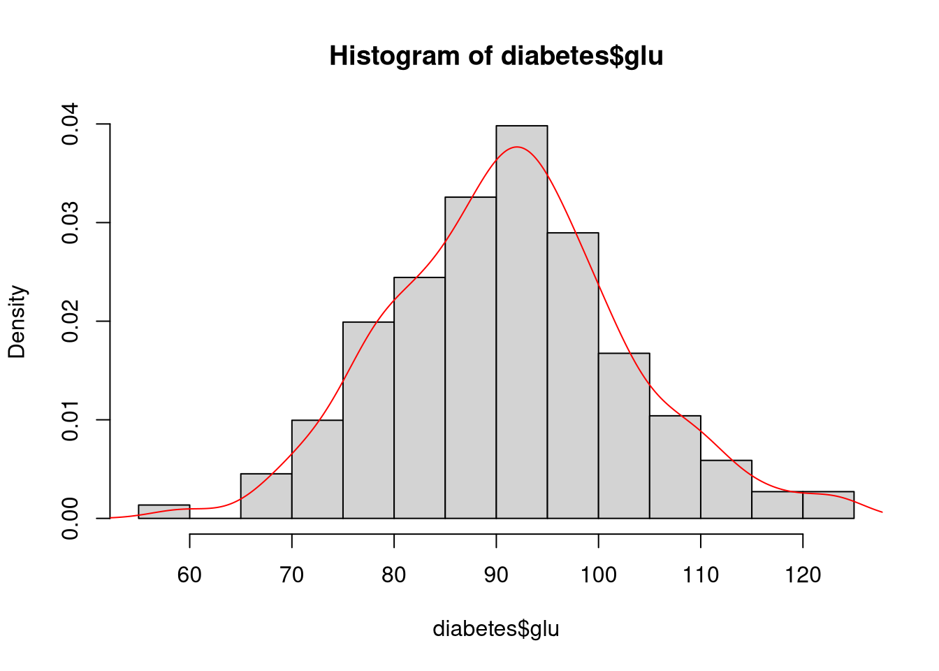
In this case, we cannot use the plot() function to create the kernel density layer since plot() would just replace the existing histogram with a new figure. Rather, we use the lines() function to add the appropriate curve as a new layer in the existing plot. Note that we’re explicitly extracting the x and y vectors from the object returned by density() to define the x and y coordinates of the line.
The Base R graphical suite offers many functions like lines() that add layers to existing plots. In the next example, we use the abline() function to add two dashed lines to denote the boundaries of the region containing the central 90% of observations.
# Create a basic histogram of average blood pressure levels
hist(diabetes$bp)

# Calculate the boundaries of the central interval containing 90% of observations
ci <- quantile(diabetes$bp, prob = c(0.025, 0.975))

# Add dashed lines to denoting the upper and lower 5% tail area cutoffs
abline(v = ci, lty = 2, lwd = 2)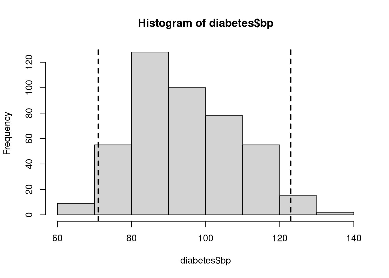
We can apply the same type of layering process to mark up scatterplots with additional information. In the following example, we add the least squares best fit line to a scatterplot showing the relation between average blood pressure, bp, and blood glucose levels, glu.
# Create a scatterplot of blood pressure against blood glucose
plot(bp ~ glu, data = diabetes, pch = 19)

# Estimate the linear regression of blood pressure on blood glucose
lmOut <- lm(bp ~ glu, data = diabetes)

# Add the best fit line to the scatterplot
abline(reg = lmOut, lwd = 2, col = "blue")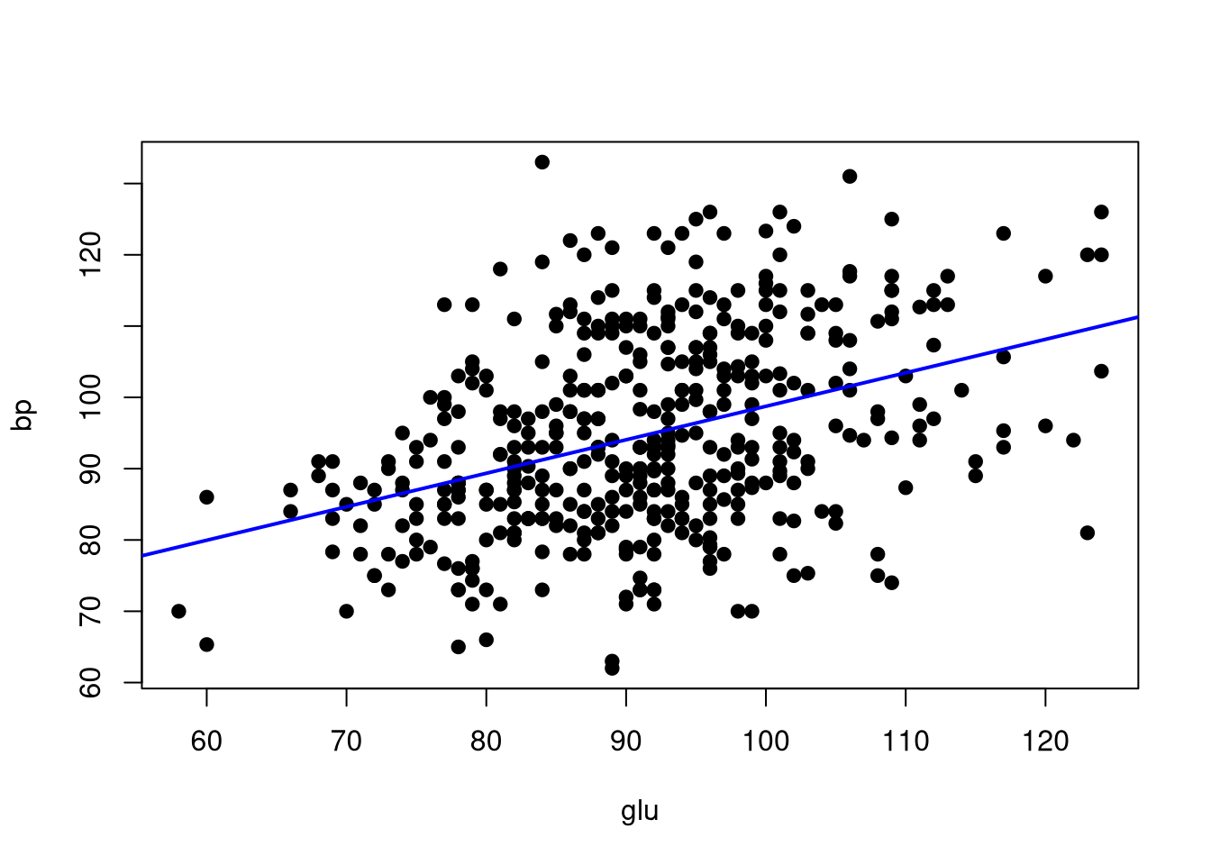
Again, we use the abline() function to overlay a line onto the existing plot. In this case, however, we define the line based on the estimated regression coefficients stored in the lmOut object that we created with the lm() function.
Use the diabetes dataset to create a scatterplot with average blood pressure, bp, on the y-axis and body mass index, bmi on the x-axis.
Add a horizontal line to the scatterplot showing the mean of the bp variable.
Add the best fit line from a linear regression model where bmi predicts bp.
What does this figure tell you about relation between body mass index and average blood pressure?
NOTE: The diabetes dataset is already loaded into the working directory of the webr session.
To implement the visual adjustments to the points and lines, you will need to adjust the values of the following parameters in various function calls.
pchltylwdcol# Create the scatterplot
plot(bp ~ bmi,
data = diabetes,
pch = 15,
ylab = "Blood Pressure",
xlab = "Body Mass Index",
main = "Association between BMI and Average Blood Pressure")
# Add the horizontal rule
abline(h = mean(diabetes$bp), lty = 3)
# Estimate the regression model
lmOut <- lm(bp ~ bmi, data = diabetes)
# Add the best fit line from the above regression
abline(reg = lmOut, lwd = 2, col = "red")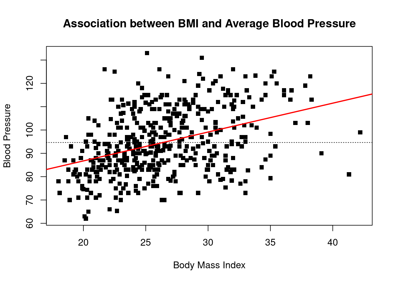
We see what looks like a strong, positive effect of BMI on blood pressure. In other words, higher BMI tends to be associated with higher blood pressure levels.