plot(y = diabetes$tc, x = diabetes$bmi)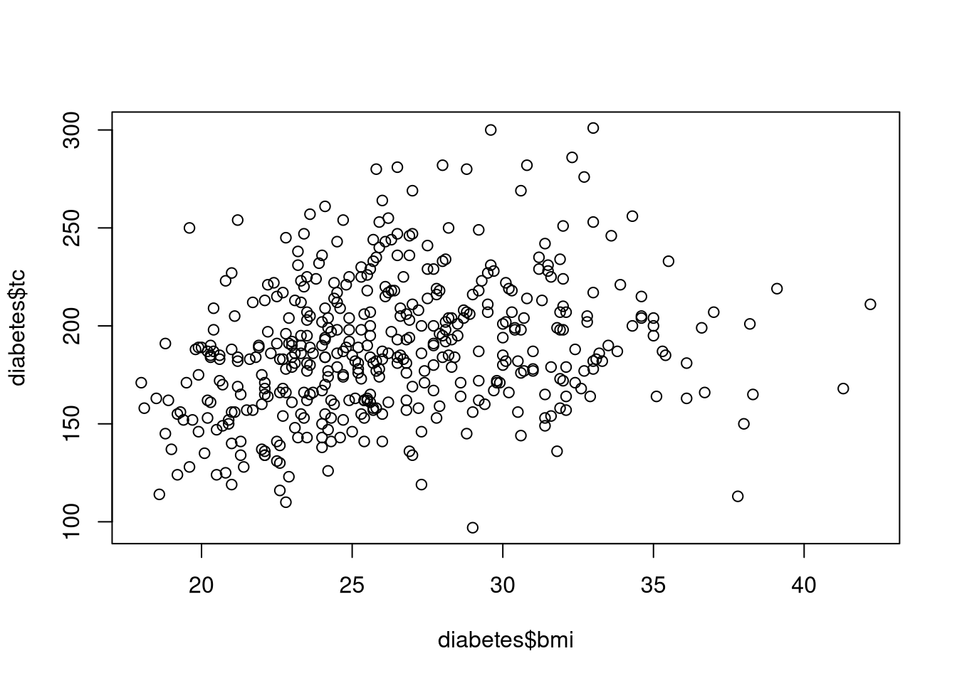
Scatterplots are one of the most fundamental tools for visualizing the relationship between two continuous variables (or variables that we wish to treat as continuous). Each point on the plot represents one observational unit’s values on the two plotted variables. This makes scatterplots particularly useful for identifying trends, clusters, and extreme values in the data.
We make a simple scatterplot with the plot() function. For example, the following code uses the diabetes dataset to visualize the bivariate association between Body Mass Index, bmi, and Total Cholesterol, tc.
plot(y = diabetes$tc, x = diabetes$bmi)
In this example, every point represents a different patient’s value of BMI and their level of total cholesterol. The points form a cloud with a slight upward trend, suggesting that higher BMI values tend to be associated with higher cholesterol levels, although the variability is substantial.
We can improve the readability by adding axis labels, a title, and adjusting the axis limits. To do so we adjust the following parameters.
ylab, xlab: Define new axis labelsmain: Add a plot titleylim, xlim: Define the ranges of the y-axis and x-axisplot(y = diabetes$tc,
x = diabetes$bmi,
ylab = "Total Cholesterol",
xlab = "Body Mass Index",
main = "Relation between BMI and Cholesterol",
ylim = c(0, 350),
xlim = c(0, 50))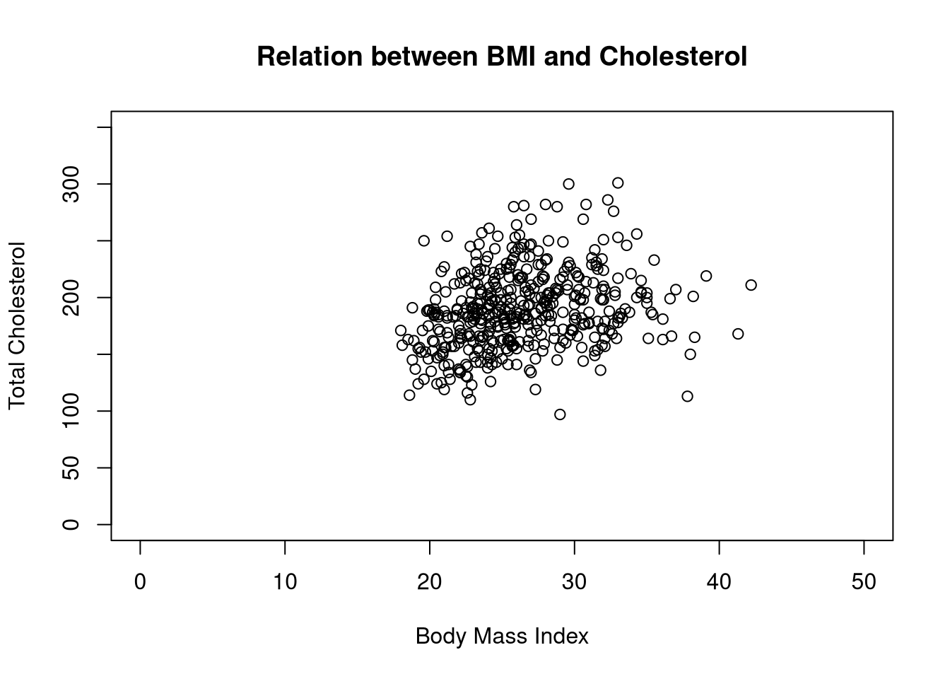
When we apply plot() to a data frame containing only numeric columns, we generate a scatterplot matrix: a grid of scatterplots showing all the pairwise relationships.
plot(diabetes[c("age", "bmi", "tc", "glu", "progress")])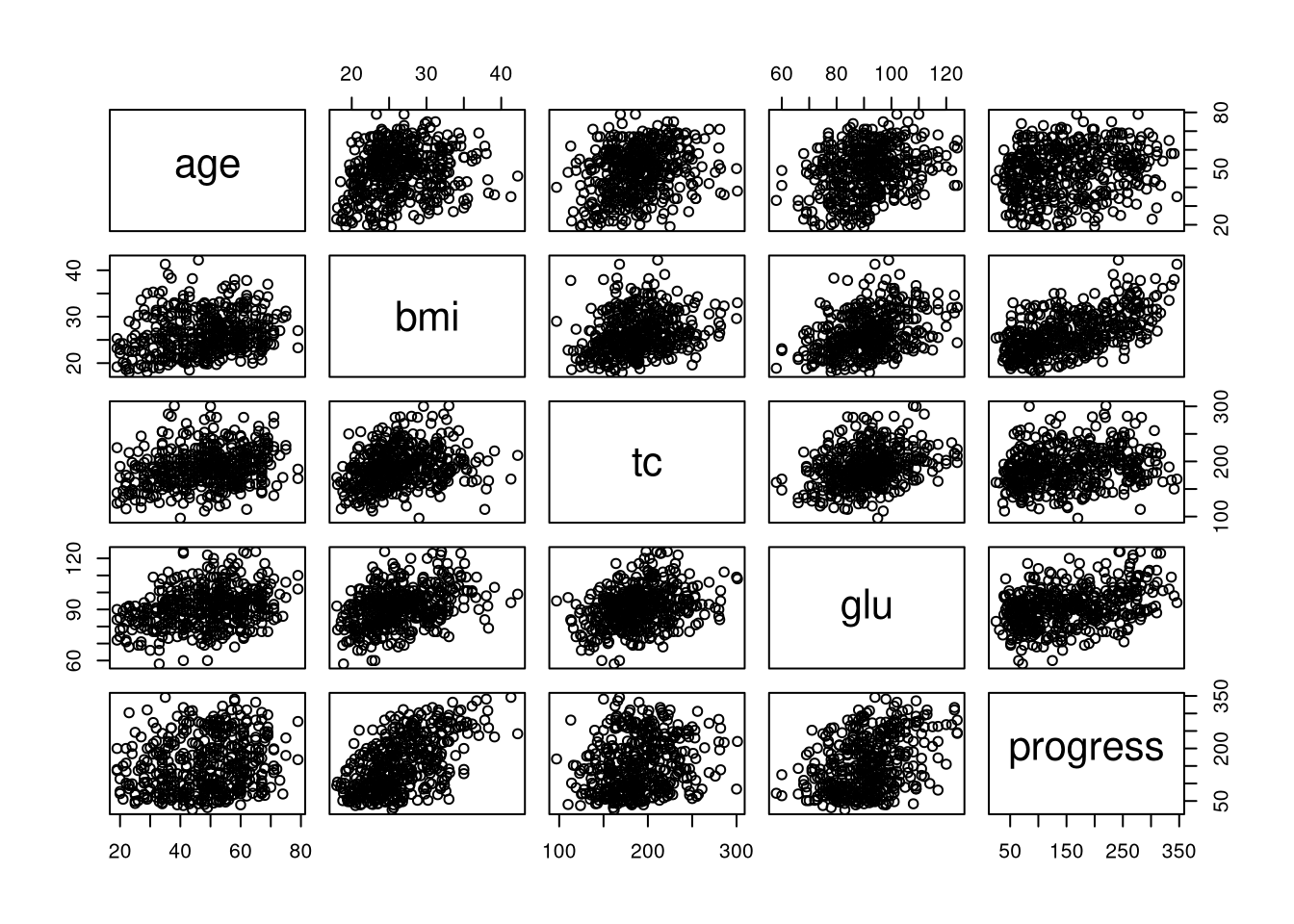
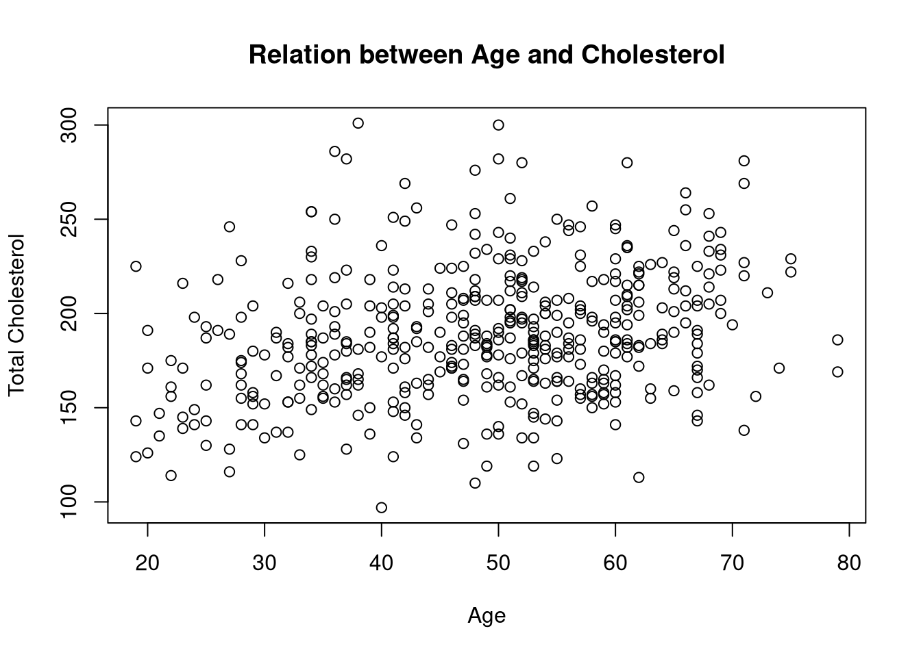
Using the diabetes dataset, make a scatterplot of total cholesterol on the y-axis against age on the x-axis. Add meaningful axis labels and a title.
diabetes dataset is already loaded in the working directory of this webr session.plot(y = diabetes$tc,
x = diabetes$age,
ylab = "Total Cholesterol",
xlab = "Age",
main = "Relation between Age and Cholesterol")