hist(diabetes$glu)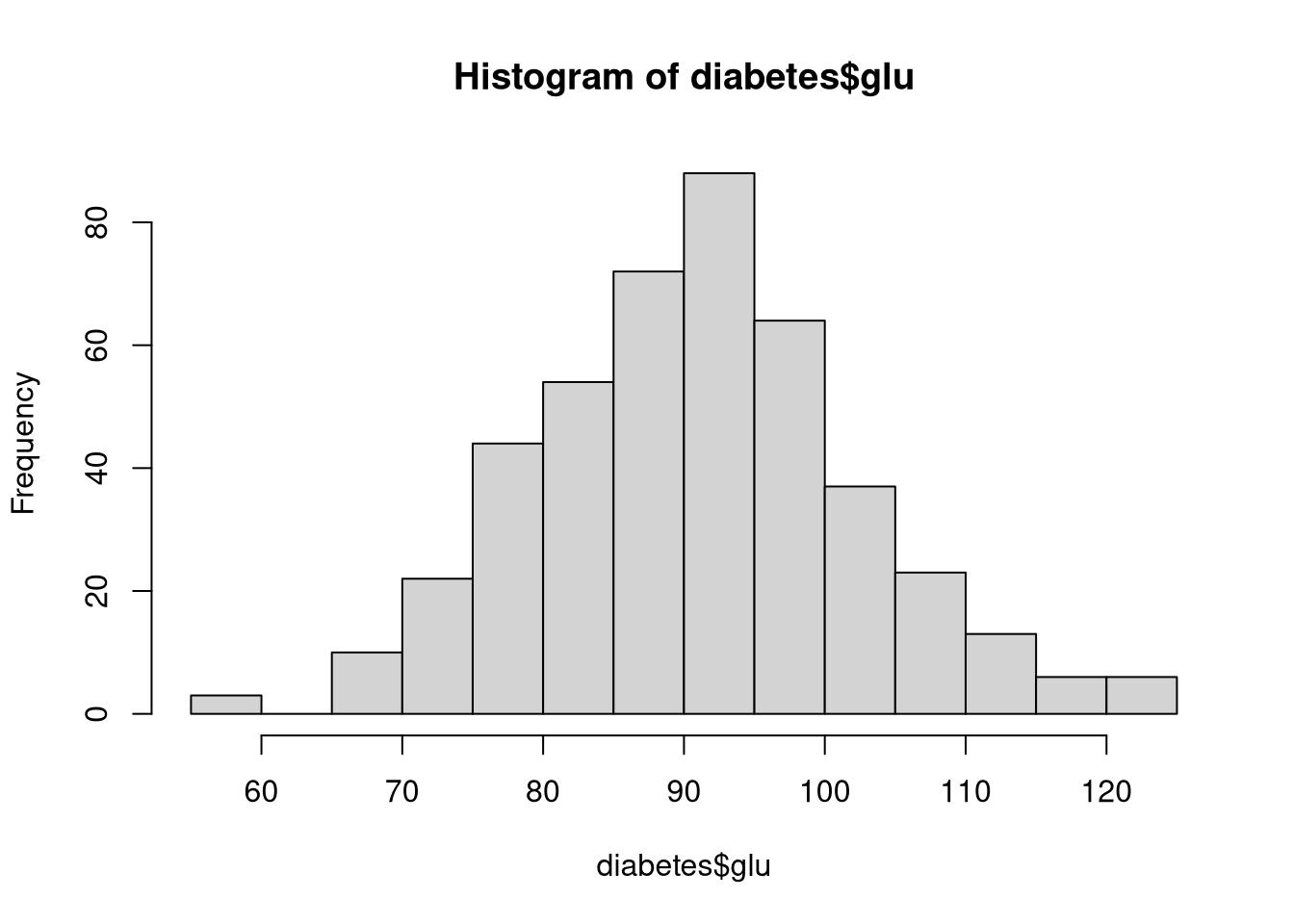
Histograms are one of the most straightforward and useful ways to visualize the distribution of a numeric variable. A histogram shows the distribution of a single numeric variable by dividing its range into bins (intervals), counting how many observations fall into each bin, and visualizing these counts as bars in a plot. Histograms are meant to represent a variable’s probability distribution, so they’re useful for understanding the shape, spread, and skewness of numeric variables
The hist() function in Base R creates histograms. For example, the following code visualizes the distribution of blood glucose levels in the diabetes dataset.
hist(diabetes$glu)
By default, hist() will try to best represent the distribution by applying the Sturges Formula to define the bin width We can alter this behavior in several ways through the breaks argument.
hist(diabetes$glu,
     main = "Define bins via Scott's formula",
     breaks = "scott")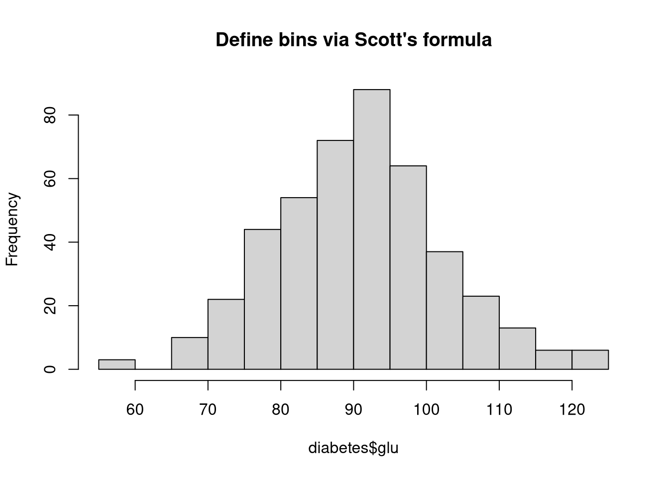
hist(diabetes$glu,
     main = "Define bins with a vector",
     breaks = seq(50, 130, 10))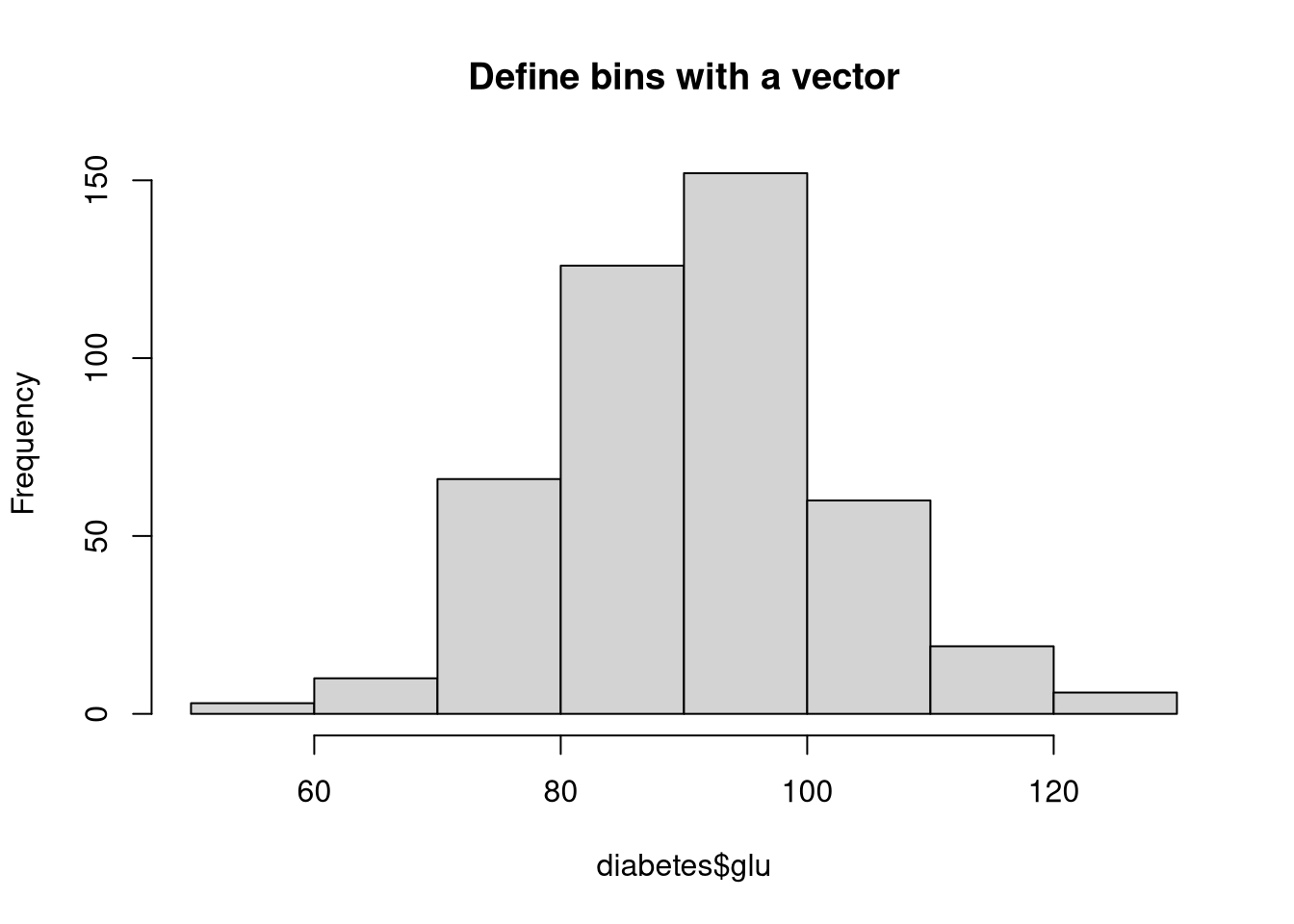
hist(diabetes$glu, main = "Ask for 5 bins", breaks = 5)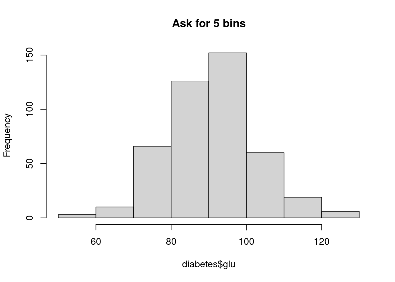
hist(diabetes$glu, main = "Ask for 50 bins", breaks = 50)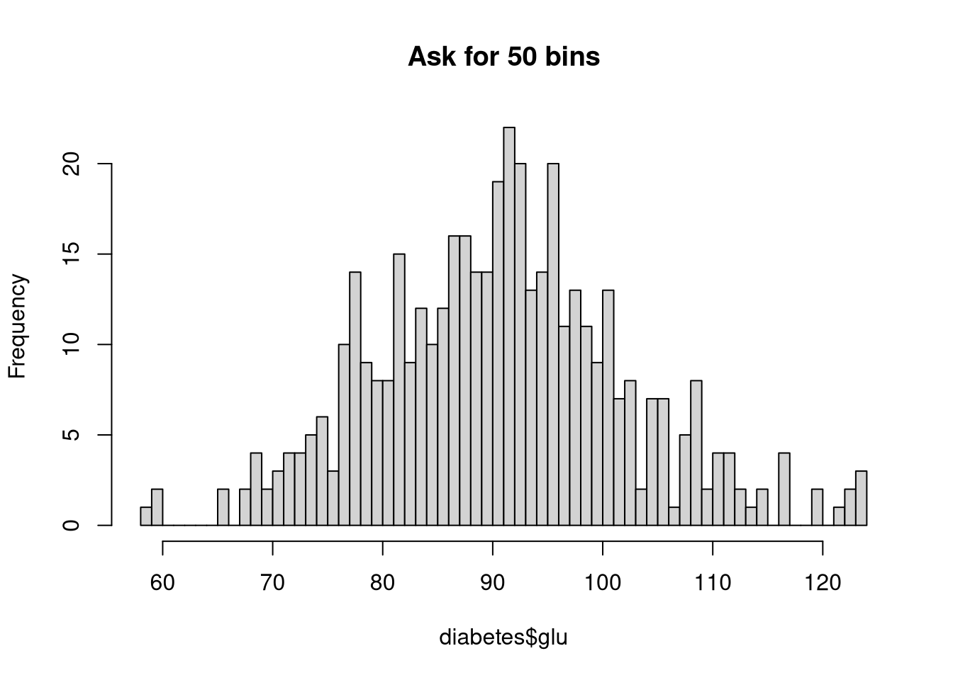
The hist() function accepts many parameters to customize the plot’s appearance. For example, in the next code chunk, we adjust the following parameters.
main: Add a better titlecol: Change the fill color of the barsborder: Change the border color of the barsprobability: Switch the y-axis to a probability scalehist(diabetes$glu,
main = "Colorful Histogram",
col = "pink",
border = "blue",
probability = TRUE)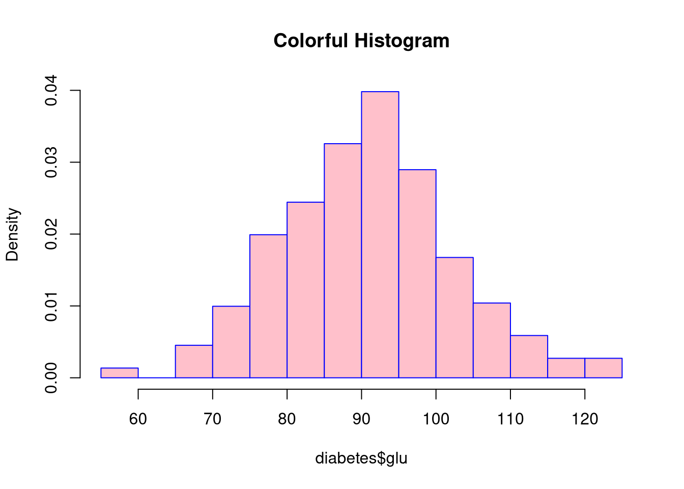
Setting probability = TRUE converts the y-axis to a probability scale and makes the histogram’s total area sum to 1. Hence the bar heights represent the proportion of the sample that falls into each bin, rather than a straight count of the observations in each bin.
The tutorial linked below gives a nice overview of the various graphical parameters you can use to adjust the appearance of Base R visualizations.
The adjustments you see above are only a tiny drop in a vast bucket of possibilities. We can tweak nearly every aspect of our visualization’s appearance by adjusting the values of the built-in graphical parameters. There are many such parameters. To see a full list of the graphical parameters, read the documentation for the par() function.
?parMake an histogram showing the age distribution in the diabetes dataset.
NOTE: The diabetes dataset is already loaded in the working directory of this webr session.
hist(diabetes$age,
     col = "green",
     breaks = 50,
     xlab = "Age",
     main = "Age Distribution")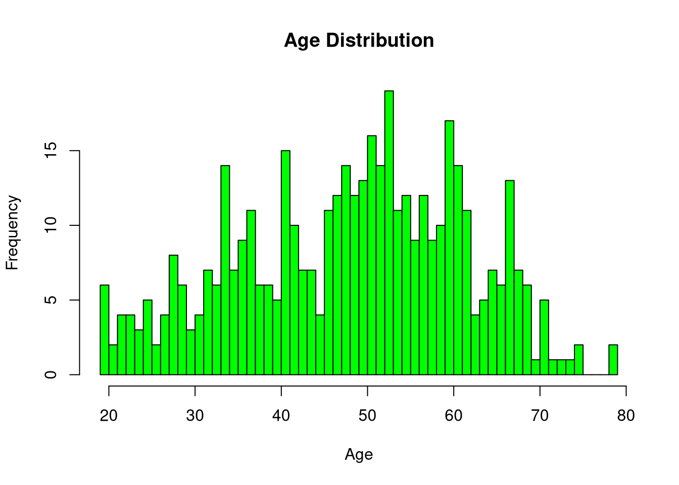
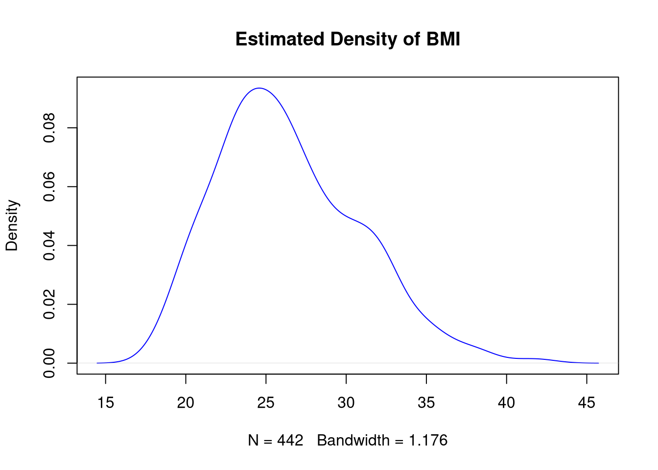
A kernel density plot provides a smoothed estimate of a continuous variable’s distribution. You can think about a kernel density plot as a smoothed version of a histogram. Essentially, we create a density plot by drawing a line that connects the tops of the columns from a special type of fine-grained histogram into a single continuous curve.
In Base R, we don’t have a single function to create a kernel density plot. We first compute a density estimate with the density() function, and then we plot the estimated density object. For example, the following code visualizes the distribution of BMI with a kernel density plot.
d <- density(diabetes$bmi)
plot(d)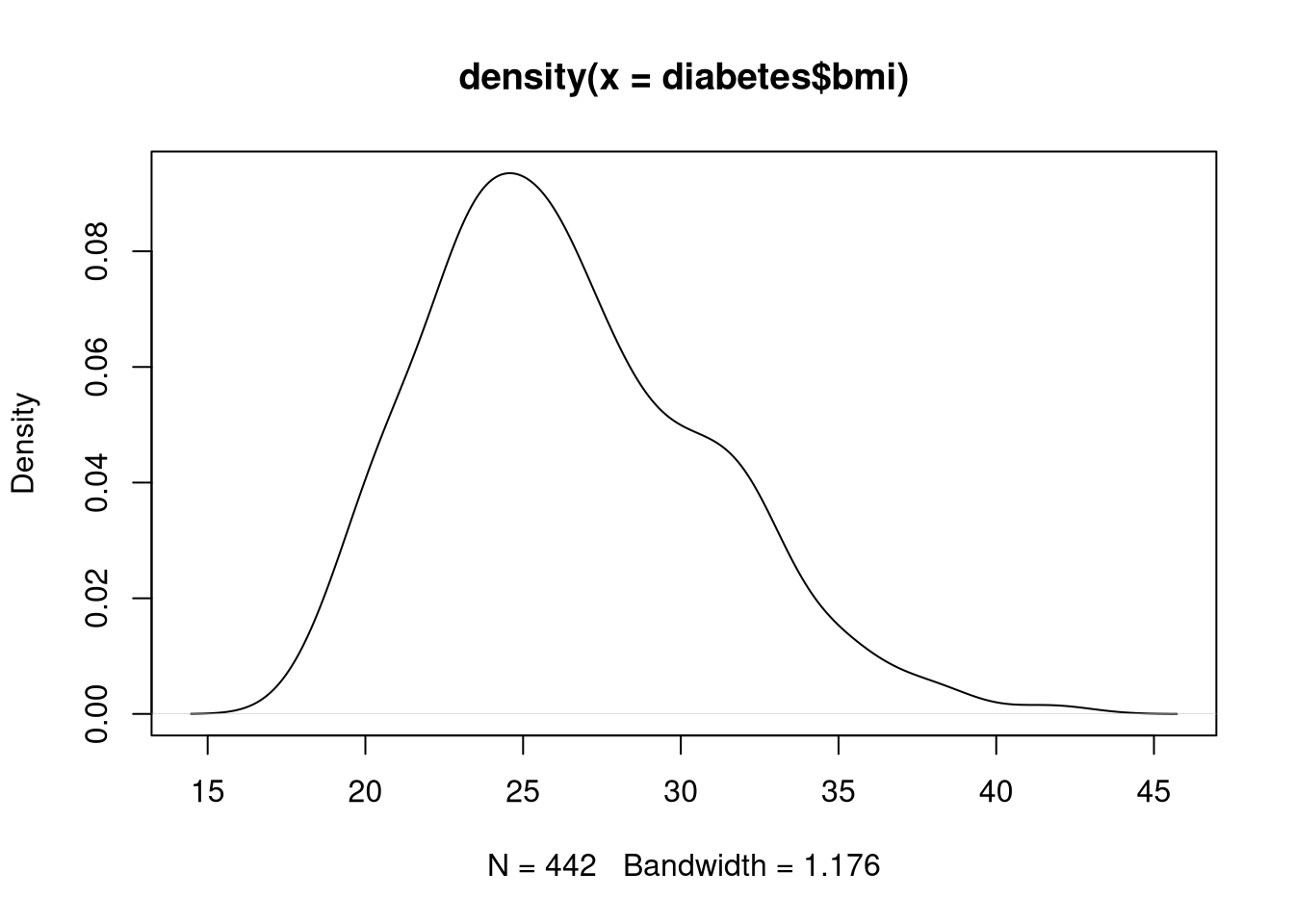
As with any other Base R visualization, we can tweak the appearance of a kernel density plot through graphical parameters.
plot(d, main = "Estimated Density of BMI", col = "blue")