# Tabulate the counts of each ticket class
classTable <- table(titanic$class)

# Create a bar plot to visualize the frequency of ticket classes
barplot(classTable)
Bar plots are the analogue of histograms for discrete variables. Whereas the columns in a histogram are defined by counting the number of cases that fall into arbitrary bins, the bars in a bar plots represent the number of cases that belong to each level of a categorical variable.
We use the barplot() function to create bar plots in Base R. As with kernel density plots, however, we first need to summarize the data before creating the visualization. Specifically, we use the table() function to create a frequency table, and we then plot that table with barplot(). The following code visualizes the distribution of ticket classes in the titanic dataset.
# Tabulate the counts of each ticket class
classTable <- table(titanic$class)
# Create a bar plot to visualize the frequency of ticket classes
barplot(classTable)
To plot the counts as proportions, we convert the data in the table before plotting.
# Convert counts to proportions
classProps <- classTable / sum(classTable)

# Create a bar plot to visualize the frequency of ticket classes
barplot(classProps)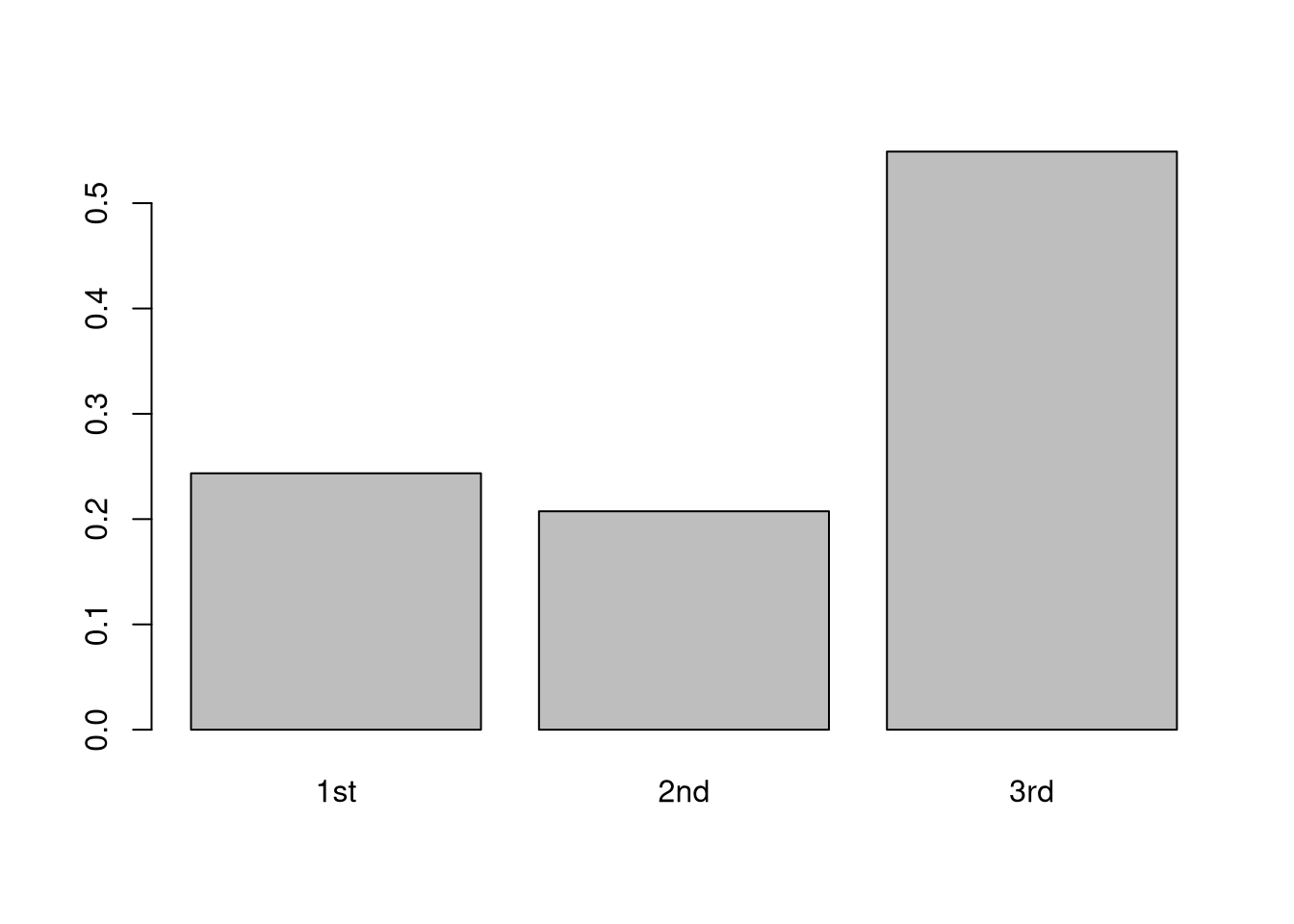
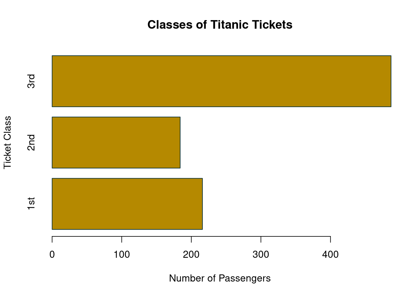
As with all of our Base R plotting, we can tweak the appearance in many ways.
barplot(classTable,
        horiz = TRUE,
        main = "Classes of Titanic Tickets",
        ylab = "Ticket Class",
        xlab = "Number of Passengers",
        col = rgb(181, 137, 0, max = 255),
        border = rgb(0, 43, 54, max = 255))