boxplot(diabetes$bmi)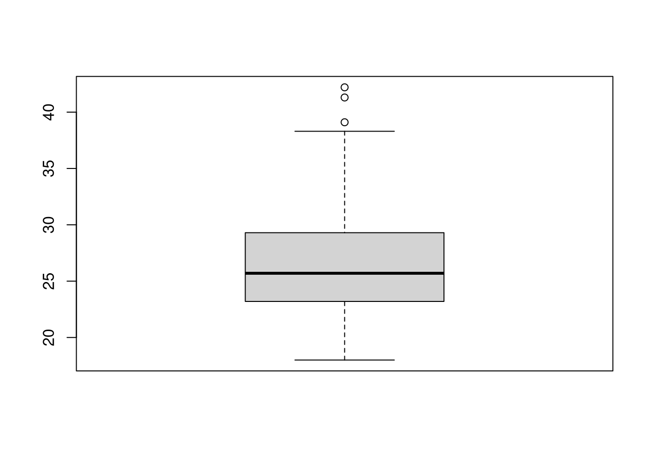
The boxplot (AKA, box-and-whiskers plot) is one of the most enduring contributions of Tukey’s seminal book Exploratory Data Analysis. A boxplot is a visualization of a numeric variable’s so-call “five-number-summary” that quantifies a variable’s distribution through five order statistics: minimum, first quartile, median, third quartile, maximum. Boxplots are particularly useful for evaluating the spread and symmetry of a distribution and checking for extreme values.
We use the boxplot() function to create a boxplot with Base R graphics. For example, the following code creates a basic boxplot of the progress variable from the diabetes dataset.
boxplot(diabetes$bmi)
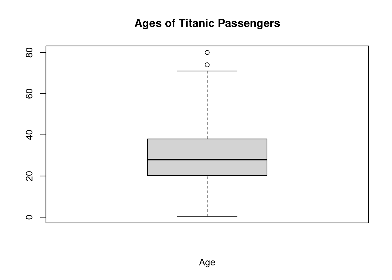
In this case, the plot indicates some positive skew: the median falls closer to the first quartile than the third quartile, and the upper whisker is longer than the lower whisker.
The “box” part of a box-and-whiskers plot is always defined by first and third quartiles, \(Q_1\) and \(Q_3\), with the median drawn somewhere inside the box. So, this box tells us something about the symmetry and spread of the middle 50% of the distribution.
The “whiskers”, on the other hand, tell us about the tails of the distribution. We can defined the whiskers in several different ways to target specific information. In the default boxplot, the whiskers are defined in terms of the inner-quartile range \(\textrm{IQR} = Q_3 - Q_1\).
We can change the weight applied to the IQR via the range argument. The following code defines the whisker margin as \(2 \times \textrm{IQR}\).
boxplot(diabetes$bmi,
        range = 2,
        xlab = "Body Mass Index",
        main = "Margin = 3 * IQR")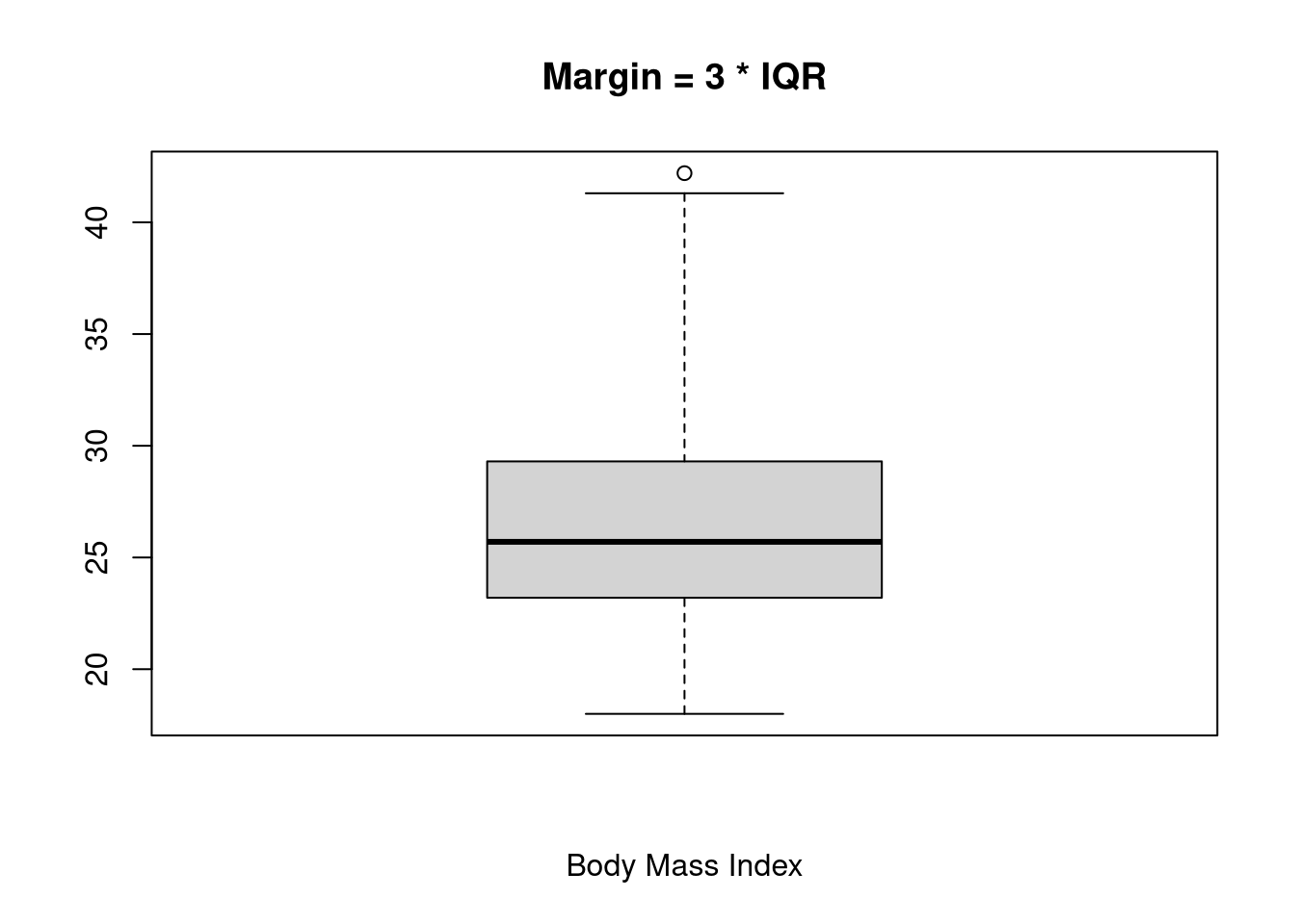
To use the minimum and maximum values to define the whiskers, we set range = 0.
boxplot(diabetes$bmi,
        range = 0,
        xlab = "Body Mass Index",
        main = "Min/Max Whiskers")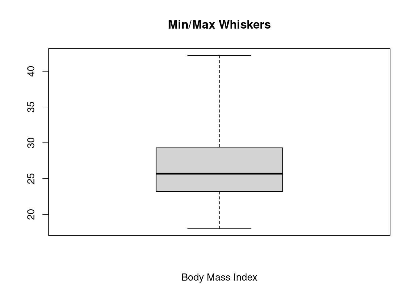
Any observations that fall outside the interval defined by the whiskers are plotted as individual points. This behavior makes boxplots a handy way to check for extreme values (i.e., outliers). If we set the whiskers so they define the range of plausible values, any points that fall outside the whiskers are possible outliers.
A common convention is to use a margin of \(1.5 \times \textrm{IQR}\) to flag “possible” outliers and a margin of \(3 \times \textrm{IQR}\) to flag “probable” outliers.
boxplot(diabetes$bmi,
        range = 1.5,
        xlab = "Body Mass Index",
        main = "Possible Outliers")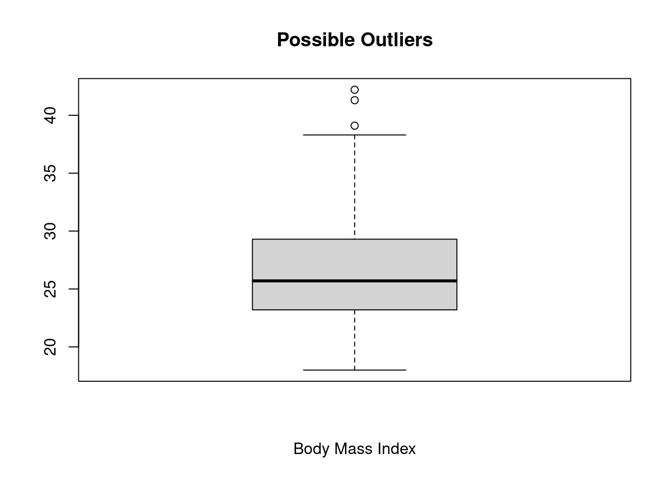
boxplot(diabetes$bmi,
        range = 3,
        xlab = "Body Mass Index",
        main = "Probable Outliers")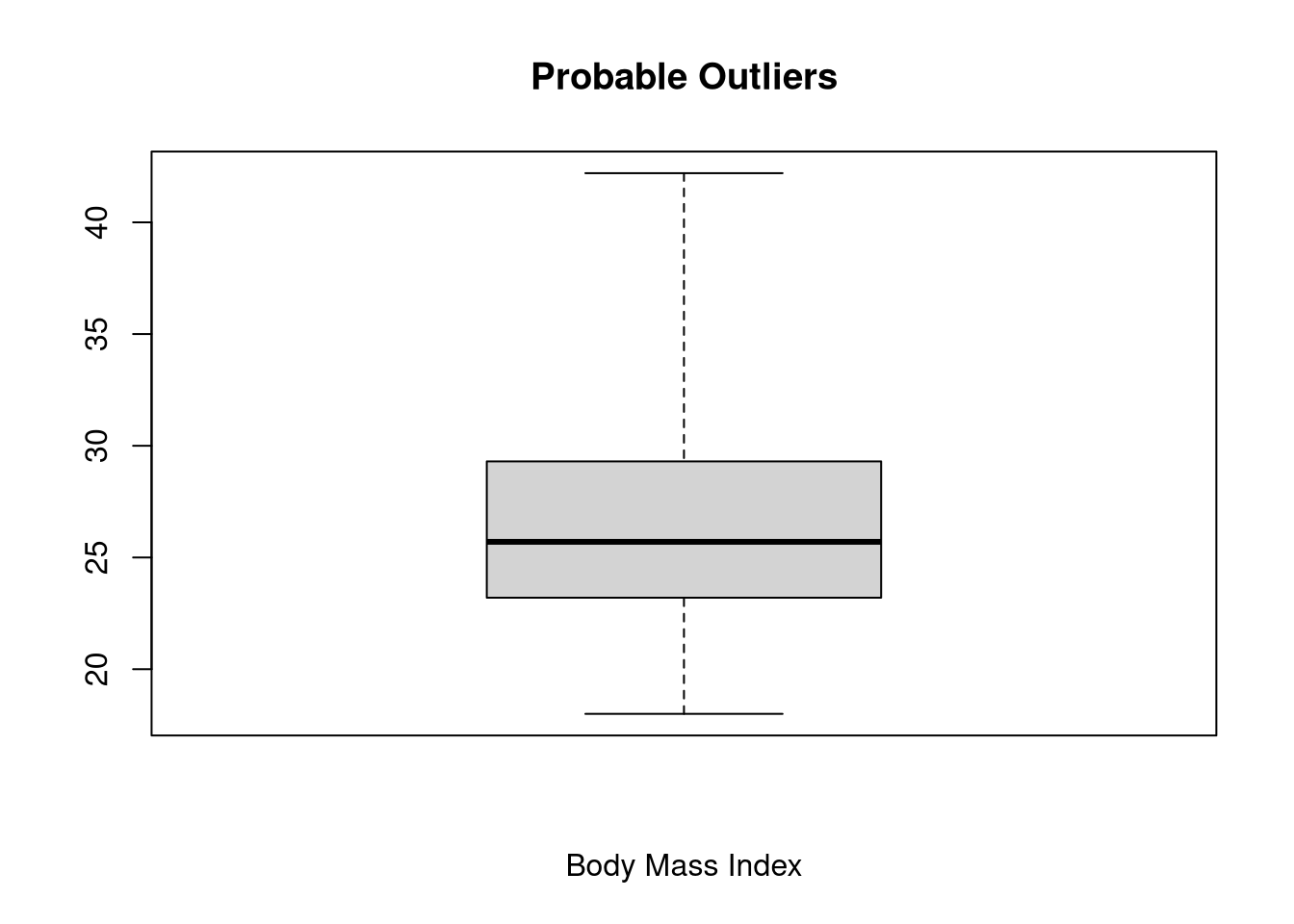
In this case, we see that 3 observations are flagged as possible outliers, and 0 observations are flagged as probable outliers.
Use the titanic data to create a boxplot of age.
NOTE: The titanic dataset is already loaded in the working directory of this webr session.
boxplot(titanic$age,
        range = 2,
        xlab = "Age",
        main = "Ages of Titanic Passengers")